TellingStoriesWithData
| home page | visualizing debt | critique by design | final project I | final project II | final project III |
Critique by Design
Step one: the visualization
Include link to the original data visualization (or screenshot - make sure to correctly cite your sources, etc.). Include paragraph or two on why you selected this particular data visualization. For obvious reasons, the data visualization you select should come from a publicly accessible source.
[Orignal Image]
Click on the Link for an interactive version. [Source: https://www.prb.org/usdata/indicator/marriage-age-women/map/state/2015]
I chose this specific visualization because I thought the data was very interesting. I am currently 22 years old and a lot of my peers post-graduation are starting to settle down and get married. I on the other hand, am foucsing on furthering my education. This specific data set and graphic was very appealing to me because it shows the differences in median age of first marriage in the United States and which is condusive to an interesting comparison between different states. I also thought that the graphic was well created and thought out so it would be a challenging redesign exercise. Although the data almost made for a map, I wanted to see if I could do something else with it.
Step two: the critique
The visualization works well in terms of providing a general snapshot of marriage trends for women across the U.S. The clean and simple design makes it accessible and easy to interpret for most viewers. The one thing with this map is that it is not telling a story, we see the numbers of median age of first marriage, but this information is lacking depth of answering any questions. For example, why is there a difference in these medians. Likewise the visualization is just a little boring, its communicating information but not in a way thats making me want to know more about these stats. What worked well were the map layout which is a familiar way for us to digest data and information, I also liked the interactive element of hovering over and seeing the individual information for every state. What didn’t work was the colors of the gradient, I would’ve personally inverted the colors or chosen a more contrasting gradient to show the contrast between states. Likewise lack of context makes the map feel flat. What I would do differently is use different colors that would be in relation to the US median instead of breaking up the gradient based on the ages. That would add another layer to the data visualization story and when first looking at the chart would show how some states are much higher than the median age while others have a much lower age. This would also the states to be in comparison and add a dynamic level to the visualization instead of having just static statistics that are a little boring. Finally, there is always a problem, as we discussed in class, about using maps to visualize data. When using maps, it is hard to distinguish population, for example at a quick glance you can see that most of the states get married before the age of 28. However the median age of 28 tells a different story, the most populous states in the country, California, NY, and Florida all have a median marriage age of >28, but since most of the Midwest, the largest region, of the United States is rural, it doesn’t seem as such. Therefore, this map is not telling the whole story due to the nature of map visualizations not accounting for population. Two changes I would make is 1.) Add a more contrasting color palette to make state differences easier to perceive. 2.) Maybe use a time series line graph to show how the median marriage age changes over time. I could divide the country into regions and observe the data in that manner.
Step three: Sketch a solution
[Sketch][]
For the sketch, I orignally thought to aggreagate all the data by regions to make the data more digestable. I wanted to see how the median age increased over time so that is what my story was with creating this redesigned visualization. I averaged all the medians and assigned different colors to different regions.
Step four: Test the solution
Before you conduct your interviews, prepare a simple script. Use this as a guide and as a way to take notes as you go forward. Come up with your own list of questions you want to ask for the selected visualization. Keep the questions broad so you can get the most value out of your feedback. Then, document answers to your questions here.
Questions to ask:
-
Can you tell me what you think this is?
-
Can you describe to me what this is telling you?
-
Is there anything you find surprising or confusing?
-
Who do you think is the intended audience for this?
-
Is there anything you would change or do differently?
Results:
| Question | 26M Student | 23F Student |
|---|---|---|
| Can you tell me what you think this is? | showing me the trend of age for first time marriage. | I think this is a graph of the median first marriage age in the us over time |
| Can you describe to me what this is telling you? | And you are breaking it down by the 4 regions in the US while also giving the overall average | this is telling me how the first marriage age has changed over time |
| Is there anything you find surprsing or confusing? | the south stayed relatively the same from 2006 to 2019. | i think it was a little confusing that there were so many lines because at first I thought the lines were for different countries |
| Who do you think is the intended audience for this? | financial institutions | I think the intended audience is people who are curious about marriage ages |
| Is there anything you would change or do differently? | would like to see it starting from 1920 and on the x axis, add a vertical line to break it down per generation | I would change the title of the graph to say median age of first marriage trend over time by geographical area of us or something like that |
Synthesis: From the feedback that I got, I learned that this representation of the data is a little confusing. I could change the title and potentially identify the United States in a more neutral color so it is not confused with the others. Based on this feedback, I gather that a line chart isn’t the best way to visualize this data and I might be more inclined to make something like a boxplot isntead of instance.
Step five: build the solution
Include and describe your final solution here. It’s also a good idea to summarize your thoughts on the process overall. When you’re done with the assignment, this page should all the items mentioned in the assignment page on Canvas(a link or screenshot of the original data visualization, documentation explaining your process, a summary of your wireframes and user feedback, your final, redesigned data visualization, etc.).
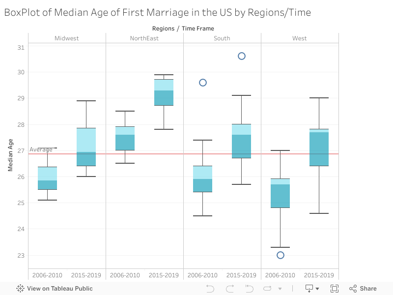
For my final redesign data visualization I included a boxplot which references the original data. I thought side-by-side boxplot would be a great way to represent the data and how the median age of marriage has changed within regions over time. A boxplot also shows outliers which might I thought would be cool to represent. The line in the middle shows the average age between 2006-2019 of average age of first marriage and I thought it would be a great reference point to add to see which regions are above/below average for comparison.